Testing Hahnemuhle Toned Papers
Many artists have struggled to keep their creativity alive in the past year and I am no exception! What usually helps me through a creative block is trying something new. So when we received these toned Hahnemuhle paper pads my brain was immediately engaged. Tag along to see what I got up to using my stash of art materials; watercolour, gouache, Indian ink, acrylic pen and ink, coloured pencils, fine liners and more!

Hahnemühle Toned Paper Pads - An Introduction
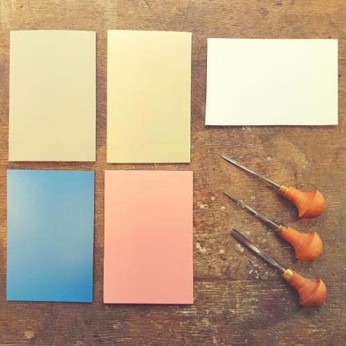
This paper pad comes in sizes A4 and A5 in grey and beige tones. Each pad contains 20 sheets in 200gsm weight, quite thin compared to the 300gsm I normally use. The paper is also made of cellulose which I have never tried (like most watercolourists I swear by 100% cotton papers like Saunders Waterford) so I was very curious to see how this paper behaves. I expected it to be great for dry media like coloured pencils as toned sketching paper is quite common, but would the paper take big washes or would I have to be mindful of how much water I used?
The first test, however, was seeing the tone of the paper. I ripped off the foil in a hurry and here's what I found:

The beige is a lovely warm mid-tone and I instantly started planning the beach/sea themed scenes I was about to paint. I found the grey a gorgeous cool grey with a tinge of purple, however, my first thought was that it's not dark enough. Will the white pop on it? I thought, let's find out! To keep the project consistent, I decided to keep to the beach/sea theme, it's what I love most and it would give the papers the chance to show their warm and cool tones through similar subjects.
1. Making Swatches
This is my favourite part of any project: making colour swatches and general testing of materials. I can highly recommend it to get right into the mood as you will usually discover something you never expected.

It was interesting to see how my array of blacks and whites are not at all the same shade! My Lukas gouache is quite warm compared to the Posca pen. This made me think the gouache would work better with the beige paper whereas the Posca's crisp white would pop beautifully on the grey. The Indian ink always surprises me with its rich black colour and the lovely granulation it can produce with wet on wet technique. I loved my Pablo coloured pencils on both, there was enough tooth to get a strong coverage with minimal effort and the colours looked very vibrant. The watercolours moved slightly to the cooler or warmer side of the colour spectrum and the gouache looked mostly the same which meant that I could use it without having to worry about it changing on the paper.
Testing the Grey Paper
The next step was to test the papers individually with selected art materials. I wanted to create 3 pieces each, one that's monochromatic, one with coloured pencils and the last one with watercolours.
1. Ink wash/Fineliner/Gouache - Brighton Pier on Grey
Materials used:
- Winsor & Newton Black Indian Ink (non-waterproof)
- Unipin Fineliners (0.2 and 0.5mm)
- Lukas Studio Gouache (white)
- Posca Acrylic Pen (1MR)

First I picked an image of the Brighton pier with a moody sky and made a rough sketch with my ballpoint pen. Then I diluted the Indian ink to lighter to darker values and I added the bigger shapes. I really enjoyed the granulation of the ink on the beach, it gave it character. Then I added the white gouache to the sky and started detailing the beach and the pier with my white Posca pen. Lastly I added the fine details with the fineliner and worked back and forth with the white and black pens until I was satisfied.

All in all I really like the look of the finished picture. The paper barely buckled under the ink so I found it easy to paint without taping the paper down. The whites popped nicely despite my initial fear that the paper would not be dark enough. Onto the next one and this time with colour!
2. Coloured Pencil Seagull on Grey
Materials used:
- Caran d'Ache Pablo Coloured Pencils (White, Black, Sky Blue, Gentian Blue, Light Ochre, Grey, Naples Yellow, Vermillion & Beige)

I thought this image was quite self explanatory so I did not take any progress pictures. As expected the paper was great for pencils, the texture of the paper really comes out in the background. The idea was to utilise the grey of the paper for the seagull's body and to use white for the highlights. This picture actually benefited from the paper being a light grey as I wanted the bird to still look white. The overall look of the drawing is a somewhere between neutral and cool which I really liked.
3. Watercolour & Gouache Octopus On Grey
Materials used:
- Old Holland Watercolours: Cadmium Red Light (warm colour), Old Delft Blue (warm), Caput Mortuum (warm)
- Lukas Watercolour: Cobalt Turquoise (cool)
- DVP Watercolour: Phthalo Blue (cool)
- Lukas Studio Gouache (White)
- Daler Rowney FW Pearlescent Ink (Autumn Gold)
This time I thought it would be interesting to show the entire painting process so I took a framelapse video. Here's my watercolour octopus.
A few things I noticed: the paper did not buckle significantly even though I was using quite a lot of water in multiple washes. The colours looked lovely and vibrant and they were very easy to lift when I was working on the octopus' tentacles. I used the white gouache to add the suckers and some gold acrylic ink for a bit of shimmer which, in my opinion. made the image pop. I really like the end results, the warm colours on the cool paper look nicely balanced.

Testing the Beige Paper
Now I was onto the main event, the beige paper was what excited me most. I enjoy warm colours and I was ready to paint some more beach scenes.
4. Coloured Pencil Seagulls on Beige
Materials used:
Caran d'Ache Pablo Coloured Pencils: White, Black, Grey, Beige, Light Ochre, Cinnamon, Chestnut, Vermillion, Sanguine, Mahogany, Raw Umber, Granite Rose & Naples Yellow

Another straight-forward drawing but this time I made better use of the tone of the paper. The beige reminded me the pebbles of Brighton beach so it provided a great background for this picture. This time I didn't want a completely opaque coverage, I used my colours sparingly and let the beige shine through. The result was a lovely warm image of this resting gull, it reminded me of hot summer days! 4 down, 2 to go!
5. Urban Sketching with Fineliner on Beige
Materials Used:
- Winsor & Newton Indian Ink
- Unipin Fineliner (0.5mm)
- Posca White Acrylic Pen (1MR)
- Lukas Studio Gouache (white and primary blue)
I wanted to do some urban sketching as the paper is highly recommended for this purpose. The tone of the paper helps you utilise it as an element of your artwork, so in this case I wanted to let the building be beige and use other colours for the rest. I picked a beige building from Brighton seafront and got right to work with a quick pencil sketch then with my fineliner.

Once the building was done, I added some white highlights to it. Then I created the blue sky with a mix of white and blue gouache. Because gouache is highly opaque I managed to block out the sky with a single layer and it created a nice contrast. I used diluted Indian ink for the front pavement. I love the fact that the beige was only preserved for the building and I can see why this paper would be a great companion for outdoor sketching.
6. Watercolour Shells on Beige
Materials Used:
- Old Holland Watercolours (Burnt Sienna, Old Delft Blue, Caput Mortuum, Yellow Ochre, Paynes Grey, Van Dyke Brown)
- Lukas Studio Gouache (White)
I left the best for last. I used an image I took on the beach weeks ago of shells and pebbles I found after a storm. This time I really put the paper to the test! I decided to pre-wet my paper before the first layer without taping down and look what happened!

This was a bit too much to ask so I taped the edges and carried on with the background wash. First I created the decking and blotted out the shells and pebbles. Then I added some more darkness to the background and a bit of detailing. Once that was done I added colour to the shells and pebbles in two layers.

Then I added the whites with gouache and some darker details on the shells and pebbles. Here's the finished image.

The beige paper really worked for this picture, both for the background decking and for the shells and pebbles. I used watered-down layers so the beige came through. The whites and darks made the subjects pop too so it didn't end up flat at all. The paper behaved well after I taped it down and I was able to lift colour with paper and wet brush. I could use multiple washes without an issue.
Closing Thoughts
I really enjoyed drawing and painting on toned paper and the Hahnemuhle Toned Paper Pads didn't disappoint. I was able to use all my mediums with success and both the grey and beige papers helped me imagine my subjects in new ways. The cool of the grey and the warmth of the beige provided me with undertones that would make the finished images without having to worry about initial washes. The undertones could also be utilised as important components of a painting whilst blocking out other areas for a contrast. I really enjoyed how the Indian ink behaved on the paper and the effortlessness of working with gouache. I will certainly use these papers in the future, especially when I am looking for a specific mood.

I hope you enjoyed this blog post and that you got inspired to try something new. Have you tried toned papers before? Are you interested in painting on grey or beige paper? Comment on our social media channels.
All items mentioned in this post can be purchased through our website http://www.lawrence.co.uk or by calling us on 01273 260260.
If you are interested in my personal work, you can find me on Instagram @judycsiky.art